Campaign for Good
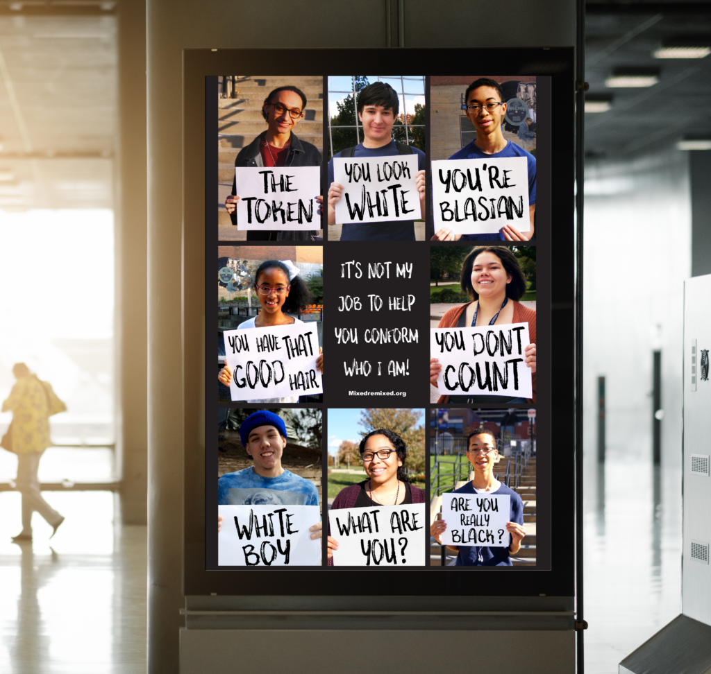
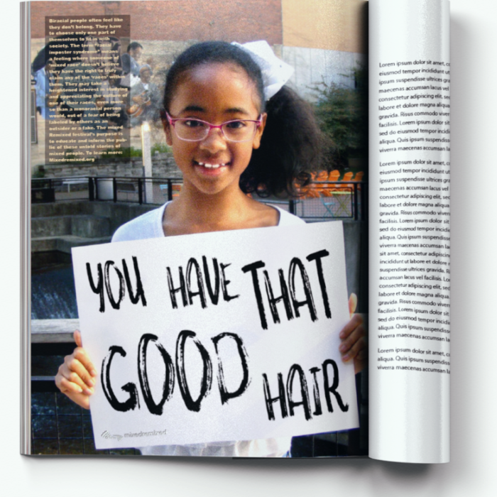
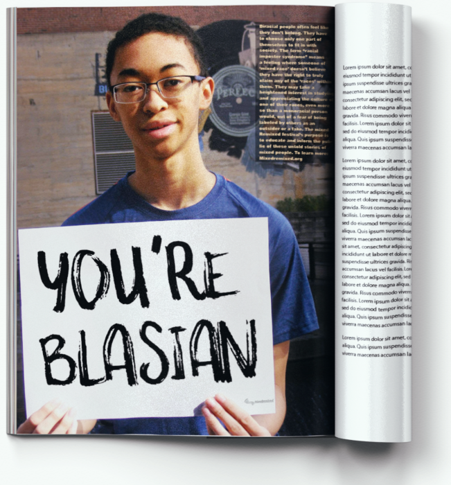
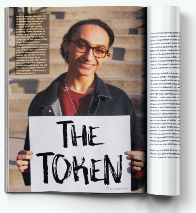
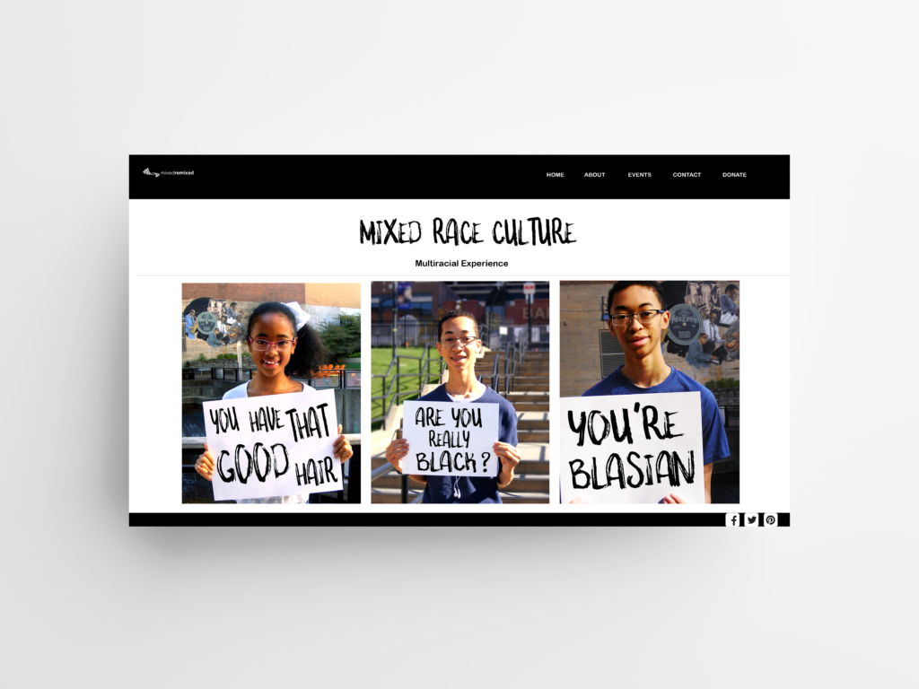
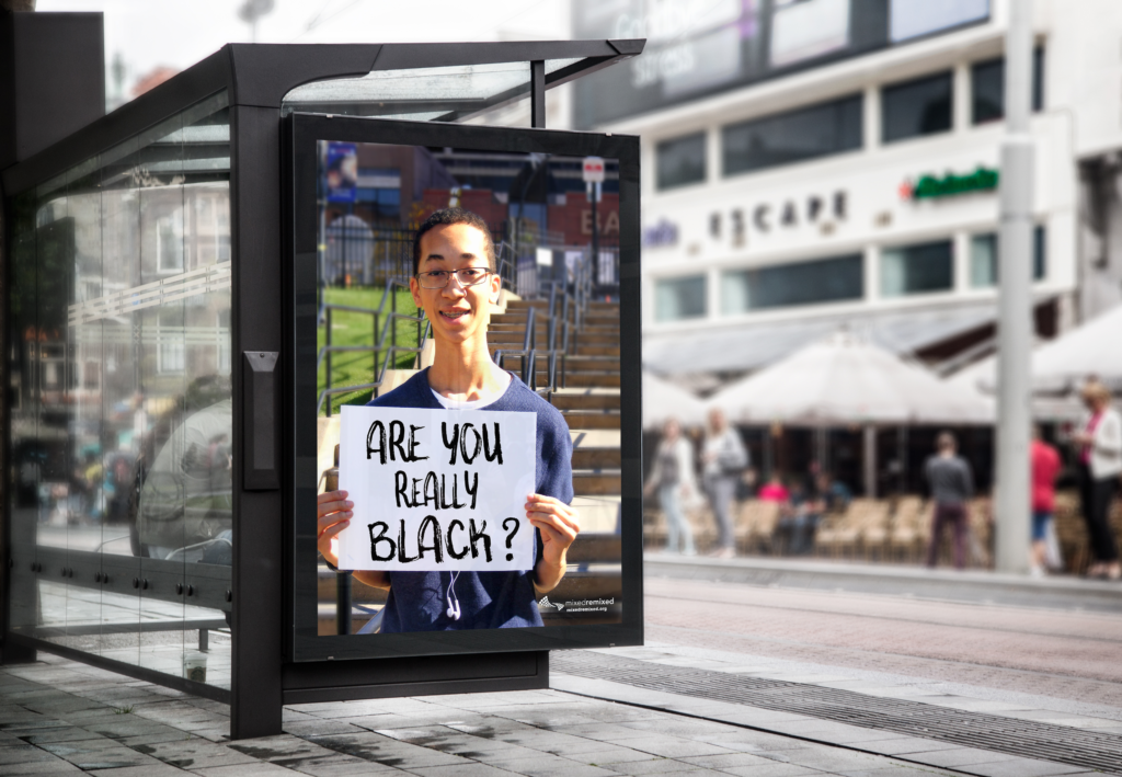
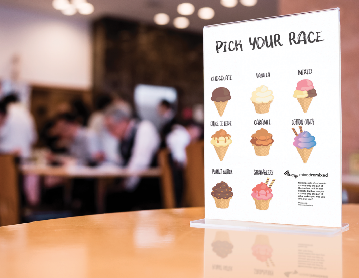
For this project, I chose a topic closer to home about what it’s like to be mixed. I wanted to bring awareness to colorism and racism towards mixed people. The idea behind the poster was to have a grid of mixed people, all different ages, holding a sign that says something they hear all the time from others. The magazine ads dive in deeper about why what people say hurts even when they mean it as a compliment. The billboard with one person holding a sign should grab your attention because of the contrast between the words and expression on the person’s face. The restaurant ad is another way to shock people into thinking about what they say about race. Here is my PROCESS!
Client: Myers School of Art: Typography 3
Role: Student
Technique: Photoshop, Indesign
Year: 2019
